Gote Construction
Transforming spaces, enhancing lives.
A distinctive brand identity that reflects Gote's vision.
Year
2023
Location
United States
Client
Gote Construction
Category
Remodeling and Construction
Project Team
Daniel Rohde – Designer
Simone Rohde – Copywriter
What We Did
Visual Identity
Social Media
Website
THE CHALLENGE
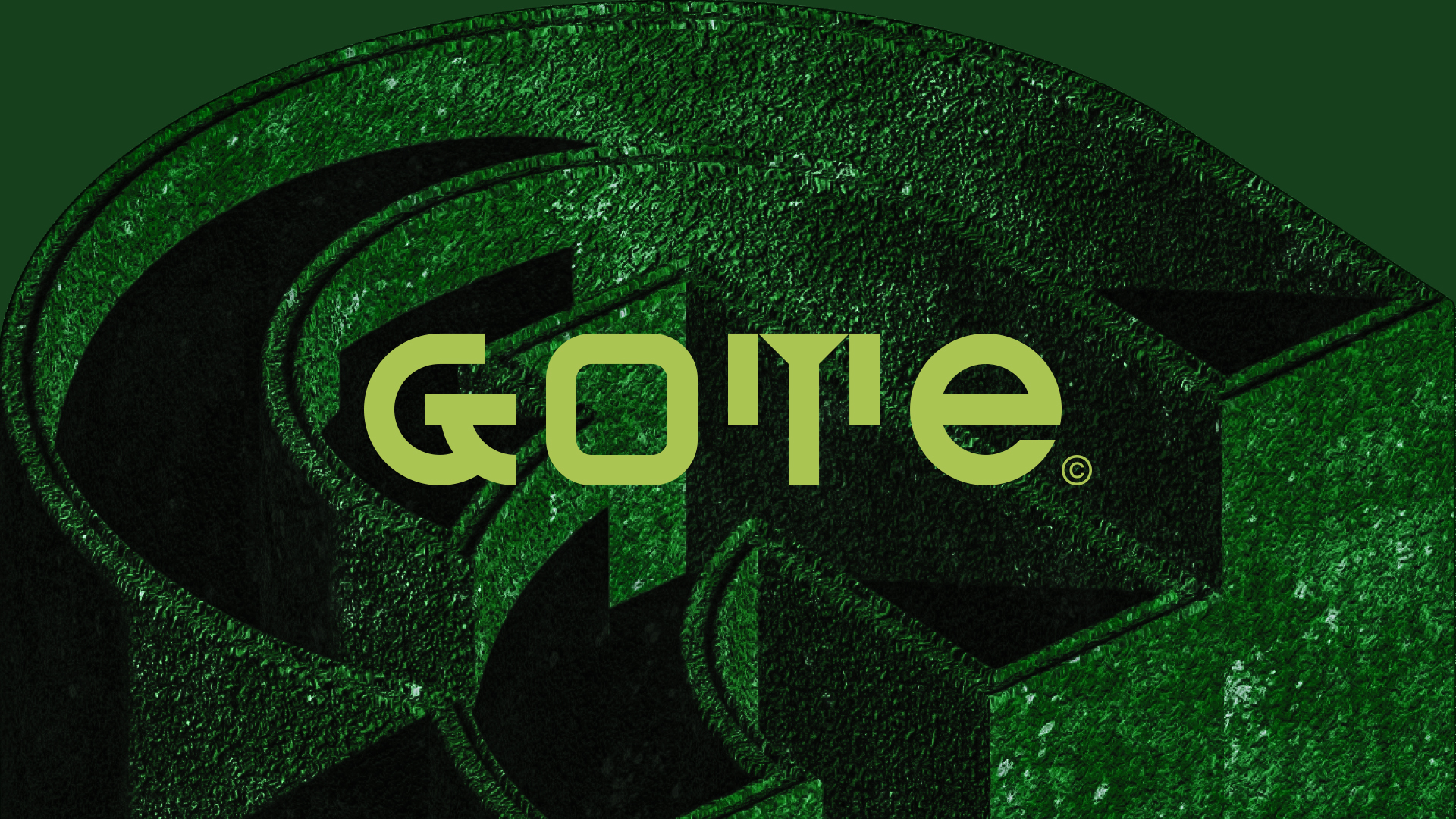
Gote is a company serving customers in the Worcester County (MA) region, the former capital of New England, offering renovation and construction services. The company, seeking to build a successful brand in the community and foster authentic connections, approached us to create its visual identity.
The challenge was to create a visual identity that stands out from the competition, study appropriate typography according to the concept envisioned by our team, and conduct research on supporting elements, graphic materials, and conceptual pieces of visual identity.
THE SOLUTION

BRAND IDENTITY
We thought of a different and bold concept that is both modern and timeless. A design inspired by the colors used in the construction industry (green), but with a splash of daring violet color.
The “G” reproduces the traces of a protractor, a special ruler used to measure angles along a circumference; it is synonymous with renovation and construction services.
The “T” reproduces the silhouette of two buildings, also symbolizing the niche of renovation and construction in a distinctive and daring manner. Boldness that extends into the mixed typography of upper and lower case letters: GoTe.


Luxurious
Feel the richness.
A refined brand identity that reflects Luxurious' vision.
Year
2022
Location
United States
Client
Luxurious
Category
Furniture, Cleaning,
Organization
Project Team
Daniel Rohde – Designer
Simone Rohde – Copywriter
What We Did
Art Direction
Brand
Visual Identity
Social Media
THE CHALLENGE
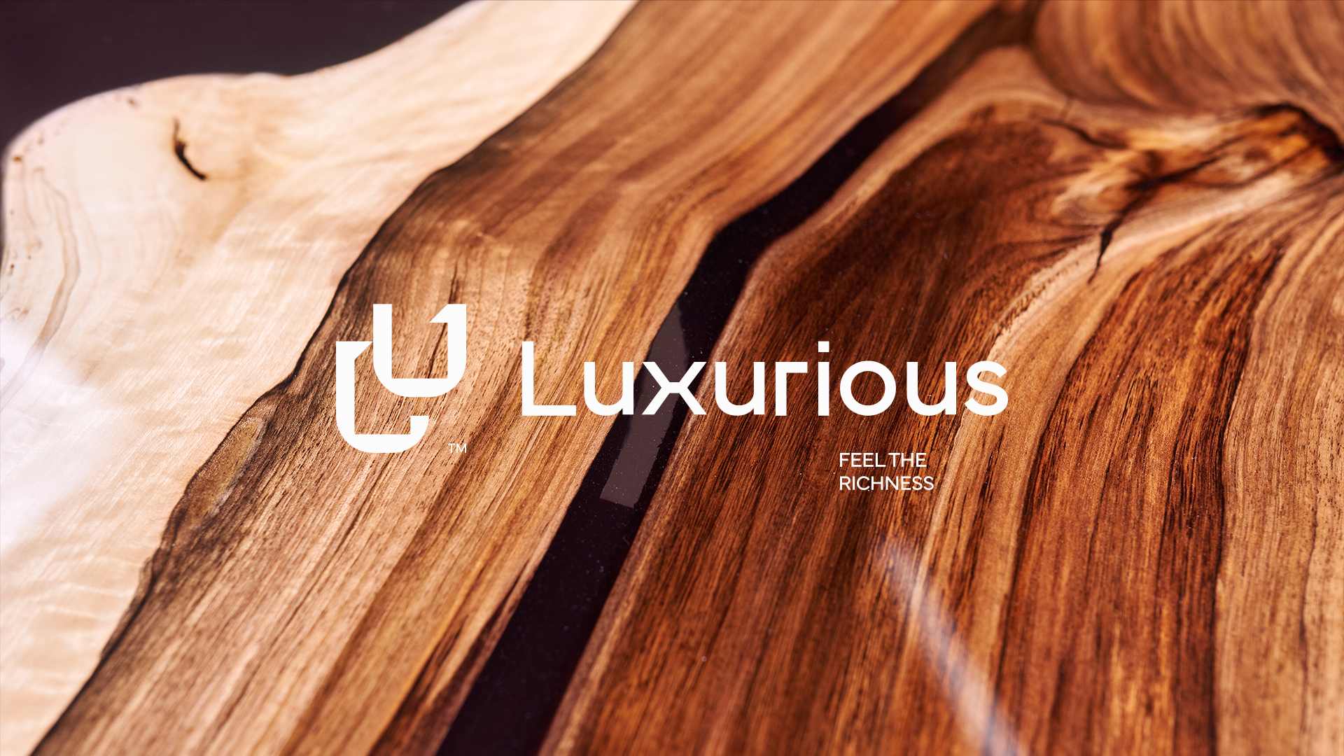
Luxurious is a company that provides residential and commercial cleaning services, personal organizing, and furniture renovation and fabrication with high-quality custom wood. The company, seeing the need to expand, came to us to create its visual identity so that it could easily communicate its vision to its customers and highlight its exceptional work.
Our objective here was to create a visual identity that reflected the company’s three main services: cleaning, organization, and furniture. We also looked at the proper typography for the overall concept our team had in mind, as well as supporting elements, colorimetry, graphic materials, and conceptual pieces for the brand.
THE SOLUTION
We thought of a refined and idealistic, modern, and timeless concept. A project that can be scaled and adapted to the three segments that the company wants to operate; and choose a separate color scheme for each service specialization while still making it cohesive.

BRAND IDENTITY
The minimalist brand was idealized in straight lines, which alludes to modernity.
Furniture angles inspired the logo, as well the brand support element comes from the brand symbol itself, which illustrates a 90° right angle of an L-shaped corner of furniture. This element can be freely utilized in promotional artwork for any advertising and publicity, including stationery, websites, automobile fleet mapping, etc., because of its versatility.
The image below served as the inspiration for this project: straight lines, a modernist blend of wood and glass, and the colors of a breathtaking sunset, which served as the foundation for the visual identity’s color scheme.


Versatto
Life is an event. Make it memorable.
A distinctive brand identity that reflects Versatto Events' vision.
Year
2022
Location
United States
Client
Versatto
Category
Decoration
Project Team
Daniel Rohde – Designer
Simone Rohde – Copywriter
What We Did
Art Direction
Brand
Visual Identity
Social Media
THE CHALLENGE
This is the kind of challenge we love: creating something from nothing that is born with a great spirit. This event planning business, Versatto, carries its mission statement in its name: versatile, always!
Versatto is a company that specializes in both private and corporate events. From wedding planning to business conferences, the company creates premium-level events, sensitive to each client’s wishes and goals, taking their expectations seriously ensuring that they have a wonderful and stress-free day.
Versatto comes from the Italian language, meaning versatile, and refers to the concept of custom and versatile events. As requested by the client, our mission here was to ‘escape’ the bride/ring cliché pattern, black on gold color, which is frequently used in this kind of business visual identity.

THE SOLUTION
Versatto Events must stand for superior, distinctive, and memorable service. By putting the public in this particular frame of mind, the brand will gain a reputation thanks to the recollection of the experience.
- Create an elegant and creative, modern and timeless visual identity that translates Versatto Events’ vision.
- Design a logo, which serves as the foundation, that inspires awe and has as core values uniqueness, excellence, and impact.
- Help the company’s premium image by making its visual identity distinctive, powerful, and stunning. A project that can be adapted to the future of the segments in which the company hopes to work in the medium and long term while avoiding the cliché colorimetry of these niche companies.

BRAND IDENTITY
Our big idea: the V. The work focuses on millimetrically designed typography, with a simple symbol that is full of visual possibilities and a beautiful color palette that reverberates across all digital and physical materials.
The company can use their full name or the name’s initial letter as their brand symbol. The worked-out V, which is shaped like a half-heart, represents the love for events, the fuel of this company. The last letter also contains a glow symbol and was employed as a supporting component in the project’s visual identity.
The stationery, uniforms, car fleet, and other elements were designed to establish a distinct personality that cannot be overlooked.


Kallamuz
Flowers for any occasion. Here, beauty comes naturally.
A memorable brand identity that reflects Kallamuz's vision.
Year
2022
Location
United States
Client
Kallamuz
Category
Decoration
Project Team
Daniel Rohde – Designer
Simone Rohde – Copywriter
What We Did
Art Direction
Brand
Visual Identity
Social Media
THE CHALLENGE
Focused on a wide range of gift boxes, flower arrangements for any event or occasion, and party decoration, the company works with four of the five human senses: touch, sight, smell, and hearing. The company produces its own spa goods, including candles, soaps, essences, and salts, in addition to selling flowers and providing training for decorators.
The challenge here was to create a symbol that translates the concept of the company’s name and vision; study the appropriate typography according to the concept our team has come up with, and carry out studies for support elements and graphic material along with the components of the visual identity.

THE SOLUTION
The responsive logo, which features a blooming calamus, was created using a grid. Therefore, the isotype can be utilized in several ways, either alongside the logotype or by itself. Even though brown and yellow are the primary colors, due to the pastel color scheme, the brand can be used in any color depending on the season, event, or target market.
The typography in capital letters brings legibility at the same time it suggests the qualitative, chic, and high aspect range of the brand.

BRAND IDENTITY
The project aimed to convey the company’s differentiation through the design of its visual identity. Personalization is the brand’s middle name, so pastel colors were used to create a visual identity that would adapt to customers’ needs. It also embraces new opportunities as the company grows and implements new ideas, products, and services.
Kallamuz identity reinforces the image of a classic and timeless brand that can be serious without losing its joviality, and direct without losing its depth.


Connection Construction
Connecting your dreams to your home.
An innovative brand identity that reflects Connection General Construction's vision.
Year
2022
Location
United States
Client
Connection Construction
Category
Construction
Project Team
Daniel Rohde – Designer
Simone Rohde – Copywriter
What We Did
Art Direction
Brand
Visual Identity
Social Media
Website
THE CHALLENGE

SOLUTION
When comparing construction companies, we have a pattern of red and black with repetitive roof symbols. We pictured a young, innovative concept, full of joy and creativity. A completely out-of-the-box project with a theme that goes beyond the obvious and will not go unnoticed in the construction industry segment.

BRAND IDENTITY
The symbol is based on the initials of the company’s name, C + G (Connection General Construction), and was designed in grids, so it’s responsive. The visual identity’s vivid colors, inspired by the reflective apparel used in construction fields, make it legible even when applied in small spaces, like an app symbol. The colors and supporting elements of this identity were also motivated by items discovered in the construction field, for example, bricks and tiles.
Connection General Construction is a brand that stands out for its simplicity and versatility.


Pro Commercial Solutions
A new view of your business.
A rebranding that reflects Pro Commercial Solutions' new mission.
Year
2021
Location
United States
Client
Pro Commercial Solutions
Category
Cleaning
Project Team
Daniel Rohde – Designer
Simone Rohde – Copywriter
What We Did
Art Direction
Brand
Visual Identity
Social Media
THE CHALLENGE
In order to provide 360º maintenance services to its customers, the company aimed to reposition and modernized its brand. This means that in addition to cleaning services, the company now provides additional maintenance services, including repairs and construction, landscaping and snow removal, among others.
The customer was emphatic in asking that the colors blue and yellow from the old logo design should be kept, as well as the initial idea of the sun and a building’s symbol. Once that was established, the challenge was to create a strong, modern, dynamic brand that stands out in the typical cleaning and maintenance market.

SOLUTION
We worked to create a symbol with a contemporary blue and yellow tonality, keeping in mind the requirement to maintain both the concept and the colors of the previous brand. By employing a grid to create the logo’s lines, we were able to create a dynamic, flexible, and versatile symbol. The typography is intended to make the name more readable and appealing by matching the new symbol’s bold and robust attributes.

BRAND IDENTITY
The new symbol was inspired by a building with imponent glass windows. With a minimalist design maintaining the original colors but in a modern tonality palette, the logo allows diverse applications multiplying the elements that can be used in the visual identity.


Interested in
working with us?
CONTACT
WORK WITH US
LOCATION
Subscribe to our newsletter.