Gote Construction
Transforming spaces, enhancing lives.
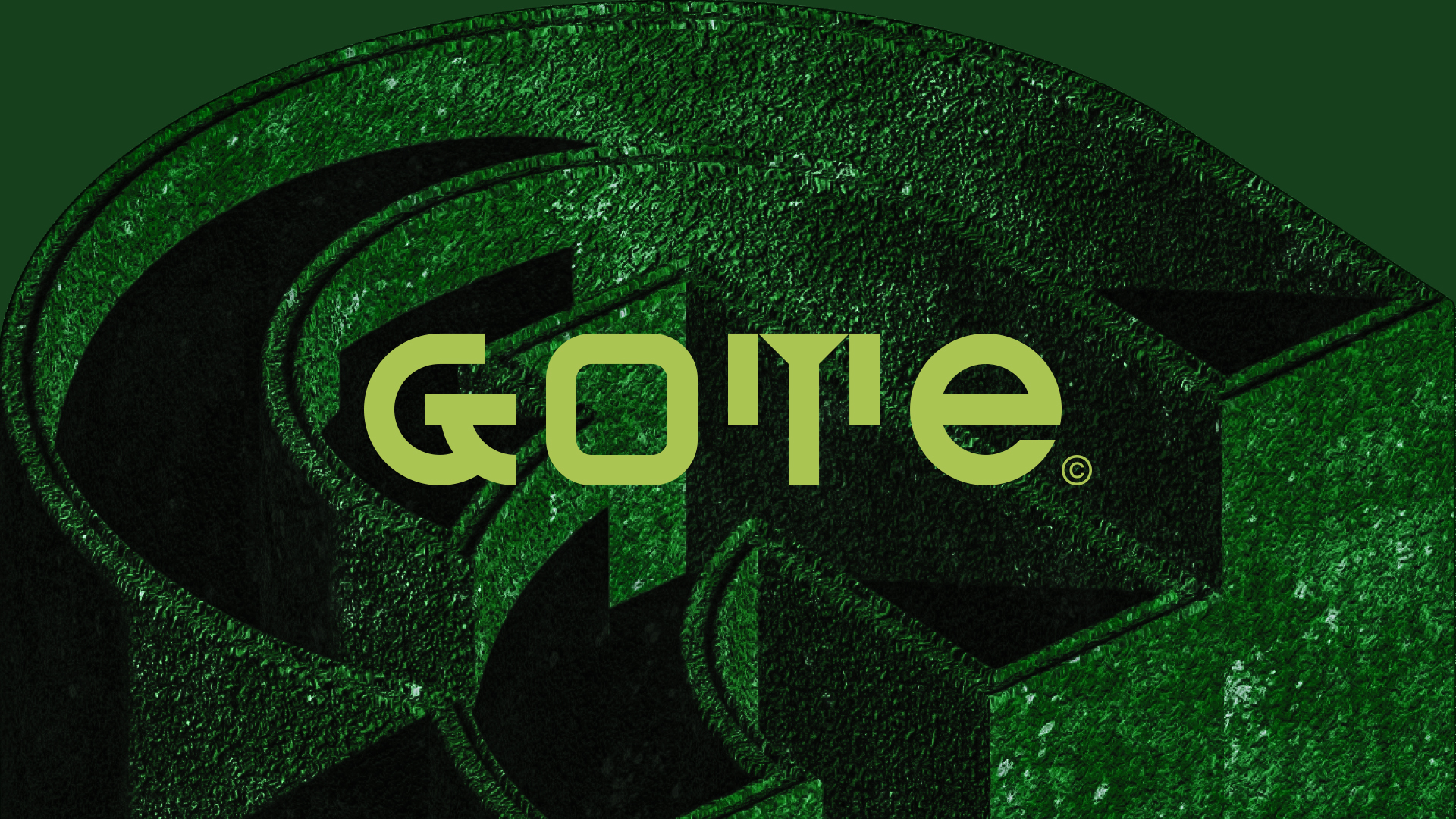
A distinctive brand identity that reflects Gote's vision.
Year
2023
Location
United States
Client
Gote Construction
Category
Remodeling and Construction
Project Team
Daniel Rohde – Designer
Simone Rohde – Copywriter
What We Did
Visual Identity
Social Media
Website
THE CHALLENGE
Gote is a company serving customers in the Worcester County (MA) region, the former capital of New England, offering renovation and construction services. The company, seeking to build a successful brand in the community and foster authentic connections, approached us to create its visual identity.
The challenge was to create a visual identity that stands out from the competition, study appropriate typography according to the concept envisioned by our team, and conduct research on supporting elements, graphic materials, and conceptual pieces of visual identity.
THE SOLUTION

BRAND IDENTITY
We thought of a different and bold concept that is both modern and timeless. A design inspired by the colors used in the construction industry (green), but with a splash of daring violet color.
The “G” reproduces the traces of a protractor, a special ruler used to measure angles along a circumference; it is synonymous with renovation and construction services.
The “T” reproduces the silhouette of two buildings, also symbolizing the niche of renovation and construction in a distinctive and daring manner. Boldness that extends into the mixed typography of upper and lower case letters: GoTe.


Interested in
working with us?
CONTACT
WORK WITH US
LOCATION
Subscribe to our newsletter.